Transportation Gets on Board with More Platforms
By Kirsten Nelson
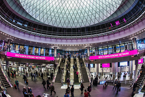
Fulton Center Three-Story Oculus Transportation Hub, New York
Customer experience is making a return trip to the forefront of transportation hub design. Prompted by increasing awareness around the human factors in infrastructure success, airports, train stations, and even bus terminals are evolving into spaces where passengers might actually enjoy their wait time.
Partly driven by the need to promote more revenue from amenities and concessions as traditional profit centers such as parking are under threat from ridesharing and a future of self-driving cars, those in the business of transportation are finding it even more crucial to deliver an atmosphere conducive to happy travelers who want to arrive early and linger awhile before they depart.
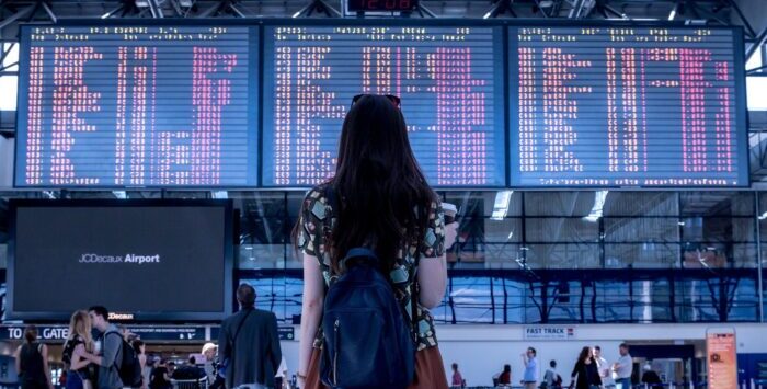
Happiness in travel is influenced most by two factors: information and atmosphere. Boosting these elements of the transportation experience are creative new implementations of technologies that link travelers with the answers they need and the comfort they seek. Now frenzied travelers are finding themselves engaged by more thoughtfully integrated data and aesthetics across a multitude of video displays that have been strategically installed along every step of a journey.
Defining Comfort Class
Now that travelers increasingly rely on their own mobile devices for updates on departure and arrival status, transportation hubs are seeking ways to augment those personal sources of data with more aesthetically driven forms of visual engagement.
Large-scale visual elements and digital signage systems are providing new and creative ways to get beyond information and into experience design. New architecturally significant, designer displays are changing the look and feel of venues. On the screens is a creative new mix of dynamic revenue-generating advertising content, easy-to-use interactive tools for wayfinding and food and beverage discovery, and helpful transportation and weather updates.
It’s information and ambience rolled into one, and that makes for happier travelers.
“What’s interesting about digital signage in transportation and with public spaces in general is that the value is in perception,” explained Eric Henry, President of Tightrope Media Systems “It doesn’t change the wait time, but it helps the perception of wait time. Or it can help with perceived aesthetics. The traveler is thinking, ‘I’m still in an airport but it doesn’t feel so bad,’ or, ‘I feel more engaged in these beautiful pictures on the screen.’”
If it seems like there’s not much profit in pretty pictures, rest assured, there are options. “You can mix aesthetics and advertising in subtle ways,” Henry noted. “You can play beautiful video from the local aquarium across nine panels, and it captures your attention. We’re starting to see more use of these nice panels, 82-inch panels or 3x3 video walls. They’ll show moving video of local attractions or scenery, depending where you are in the facility and the aesthetic of that space. You can do that and it doesn’t feel overwhelming.”
Speaking of overwhelming, there’s an increased sensitivity to information overload as well, Henry noted: “With the proliferation of displays everywhere you look, how do you capture attention? We’re seeing it go from complex to simple. When a traveler needs to find what they want to do, the display just gives them a few buttons, and then maybe a giant map. There’s going to be more and more refining of digital signage. It will be more of a design thing. As more and more designers take over you’ll see an enhancement in the simplicity of the user experience.”
Looks Good, and It’s Smart, Too
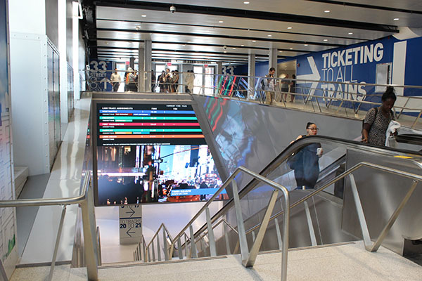
Moynihan Station
A most symbolic righting of transportation wrongs is taking place at the nation’s busiest train station now. The expansion of New York City’s Penn Station across the street to encompass its original architectural twin, the James A. Farley Post Office Building, will hopefully ease the urban planning regrets associated with the destruction and burial of the historic train hub beneath Madison Square Garden. When the renovation is complete in 2021, the new Moynihan Station will allow travelers to once again bask in architectural splendor beneath the massive skylights across the entire boarding concourse.
To kick off the restoration of travel happiness, phase one was recently completed with aesthetics at its core. “Moynihan was a space where the main concern was ambiance,” said Chris Mascatello, EVP of Technology Solutions for ANC, the AV technology integration firm that outfitted the new entrance with a series of atmospheric LED ceiling features and displays that create the impression of open sky and clouds. “It was a space with low ceilings, and the idea was to make the passenger experience better by introducing color and dimensionality overhead.”
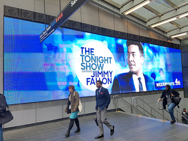
Fulton Station Video Displays
The idea of video-enhanced ambiance is spreading. Further downtown in Manhattan, ANC also brought large-scale creative video to another new transportation hub. The Fulton Center, with its three-story oculus transportation hub, is ringed by the Westfield World Trade Center retail area. Here, video displays work on many information and advertising levels. These include a 285-foot-long, 10-foot-high LED video wall in the most glamorous portion of the facility, and extend to some very thoughtful implementations of digital signage content on several clusters of displays deep within the subway tunnels.
It won’t be a surprise that in addition to providing a bit of eye candy, these displays were built with revenue generation in mind. “If you can present the information and find a way to monetize the investment, and not have it be a hard capital cost but rather it’s going to pay for itself, that’s a benefit to all groups involved,” Mascatello noted.
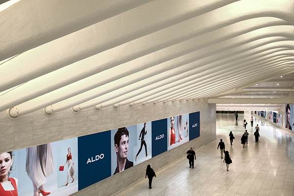
Westfield World Trade Center
To succeed in this objective, however, requires thoughtful creative content. With displays everywhere at present, it’s vital to make sure your message “isn’t just white noise that’s being ignored,” Mascatello said. He described a new trend of spreading a brand message across several adjacent displays, or scattering pieces of related content to many locations throughout a transit system, “so that you’re almost playing connect the dots. You have to do something that’s either clever or ever-changing for passengers who are going to pass it twice a day, every day.”
What’s next for these visual outlets is targeted media, which gets into real-time demographic analysis and delivers content based on the population traveling through a space at a given time. “That’s really the next wave of where content management is going—the live programming, treating the clientele as a variable in and of themselves, and choosing content based on who’s actually there.”
Traffic Merges Ahead
As information and aesthetics merge, so too does the data on the back end. Transportation hubs are connecting travelers with the information they need across transit platforms, handing off pieces of relevant data the way a large display might re-emphasize the alert that just appeared on a mobile phone.
Here the customer experience driver is most focused on the vital statistics for transportation. “Their goal is to provide a safer environment and timely travel information, and they’re leveraging technology to improve communication and awareness,” said Greg Sparrow, Vice President of Transportation Solutions with SIGNET Electronic Systems
“Then they dovetail that data into how they update customers about the status of trains, buses and boats. Nothing is more frustrating than standing on a train platform and thinking there’s a train arriving, and it’s 15 minutes late.”
More transportation agencies are deploying predictive technologies that compare schedules with real-time data from train control systems to deliver more accurate updates on arrival and departure times.
From there, Sparrow said, “it’s about how they share that information. It’s one thing to play an announcement on the station platform and display it on video signage, and then it’s providing those updates on web portals and apps.”
With more platforms as outputs, transportation hubs are also merging inputs to help provide valuable real-time information to customers. “More and more we’re also seeing transportation locations starting to carry information on other means of transportation as well. So a passenger might see Taxi and Uber wait times, or a train facility might offer airline information and vice versa,” said ANC’s Mascatello. “In some cases it’s showing the comparative benefit of using their service versus another. Some municipalities are showing that the subway is this much faster than if you were taking a car or connecting to other services.”
As a whole, the transportation experience is improving with new ways to communicate information and engage travelers in more aesthetically pleasing content. The integration is becoming tighter between agency communications and personal mobile devices, and that will hopefully help deliver happier travelers to transportation hubs everywhere.


